Tuition pricing decisions must balance each program’s expected student demand (at a given price) against its per-student contribution margin and recover the institutions full costs when all the programs are added together. The Pilbara model calculates fully loaded and net margins (based on gross tuition and fee revenue, offset by financial aid / scholarship / waivers expenditures) for programs, faculties, departments, and individual courses. The historical model looks at results for past years and the predictive model projects what will happen if prices are changed. If planners think the price changes will affect enrolment, that, too, can be captured in the predictive model.
The ability to understand and project the relationship between prices and margins becomes all the more important as competition increases and virtual programs proliferate. Proper pricing of new programs is especially critical, since no historical information about these programs is available.
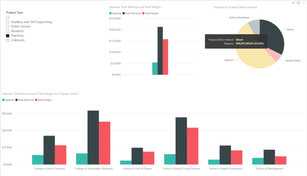
The following dashboard, which shows an American university’s full cost (including overhead), revenue, and net margin illustrates the kinds of historical information that are reported routinely by the Pilbara model. It can be seen that all schools except the School of Management cover their full costs, and that some of them make considerable money. This suggests that there is no overarching pricing problem, though of course the university may want to adjust the prices for particular programs. A failure of the University as a whole to cover its full costs would signal impending financial difficulty.
The model also calculates direct costs and gross (i.e., contribution) margins. It was noted in our post on Marginal Costing that even if revenues don’t cover full cost, they may more than cover direct cost and thus contribute to a component of the overhead. Eliminating courses or programs with positive gross margin would not reduce the university’s overall costs. In fact, this actually would increase the overheads allocated to other courses and programs.
The following dashboard shows the direct cost analogue to the one for full costs that was shown above – notice that all units, including the School of Management, have positive contributions to overhead.
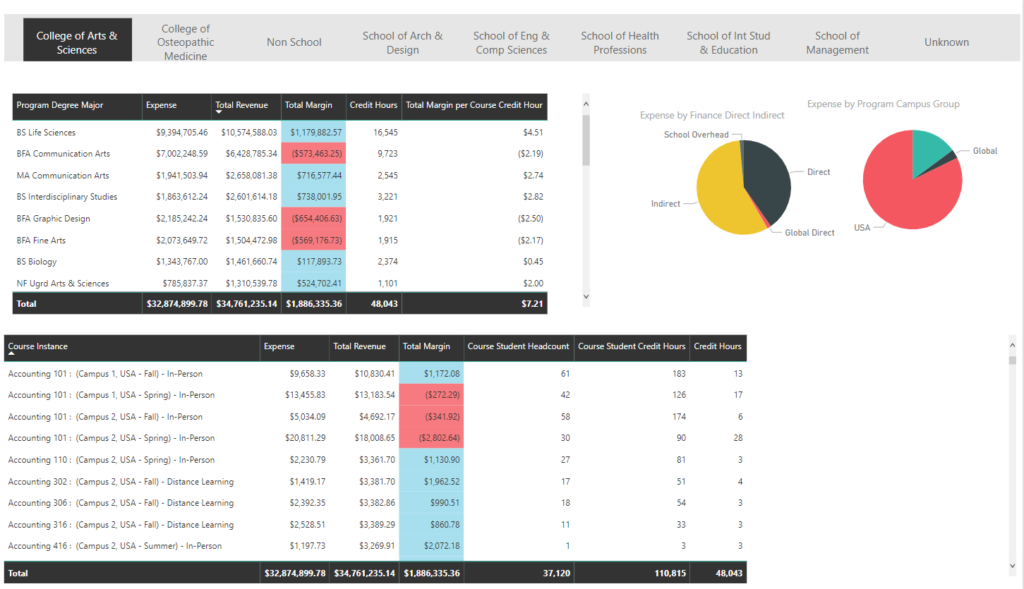
To look at individual program prices we must drill down to data on individual programs and courses. The full cost data are shown in the following dashboard, the direct costs can be obtained by clicking that slice of the pie chart at the upper right.
If we zoom in on the program detail we can see that three of the first four programs are more than covering their full costs, with the BFA in Communication Arts currently running at a loss.
We can zoom to course level to see where an individual program is making or losing money. These data can provide insights about where program prices and course fees might need to be modified. We could use the predictive model (which includes the same dashboards) to test specific pricing alternatives.
The analysis requires an extra step when it comes to costing and pricing new programs, but this is well within the capacity of the predictive model. Planners must enter the program’s courses, expected enrolments, and prices into the model, which then calculates the resources needed, the revenues to be obtained, and the resulting margins. We plan to elaborate on that in a future blog.
Research can also be examined in the models, specifically identifying direct and overhead expenses to support research projects. This can be valuable data when negotiating with business firms and other sponsors to ensure the full cost of research projects is taken into consideration.
As an example, certain types of research projects are allowed to include nominated overheads in their expenses, so knowing this is very useful. For commercial projects, the institution would want to know the full cost of conducting the research so that they can make a conscious and knowledgeable decision regarding what ‘price’ to charge.


